If you have ever stared at a wall of paint chips and felt oddly overwhelmed, you are not alone. Color has a sneaky way of changing the whole mood of a room, and the most talked-about paint colors 2024 proved that people were craving more than just something pretty.
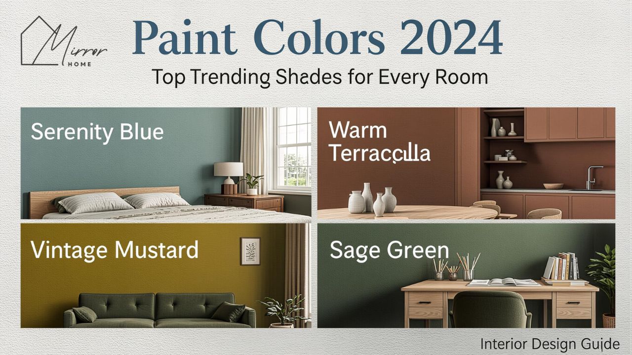
This year’s standout shades leaned into comfort, personality, and calm. Instead of flat, forgettable neutrals, homeowners and designers gravitated toward airy blues, softened blacks, grounded greens, and richer tones that made a room feel personal. Sherwin-Williams named Upward SW 6239 its 2024 Color of the Year, Benjamin Moore selected Blue Nova 825, BEHR chose Cracked Pepper PPU18-01, and Valspar went with Renew Blue 8003-37D. Taken together, these picks reveal a strong shift toward soothing blues and confident darker accents.
That matters because paint is one of the fastest, least expensive ways to change how a home feels. A smart color choice can make a cramped bedroom feel softer, a busy kitchen feel cleaner, or a dull entry feel more inviting. When you understand the tones shaping paint colors 2024, you stop choosing paint at random and start choosing it with purpose.
What made paint colors 2024 stand out
The easiest way to describe paint colors 2024 is this: they felt emotionally tuned in. People were not just asking, “What looks trendy?” They were asking, “What makes my home feel calmer, warmer, and more like me?”
That shift shows up clearly in the official color picks. Sherwin-Williams described Upward as a “breezy, blissful blue,” Benjamin Moore framed Blue Nova as an elevated blue-violet with classic appeal, BEHR positioned Cracked Pepper as a versatile soft black, and Valspar described Renew Blue as a green-influenced blue that creates peace.
In real homes, that translated into a few practical style moves:
- Light blues replacing plain gray in bedrooms and bathrooms
- Deep, soft blacks showing up on cabinets, doors, and accent walls
- Blue-green tones bringing a spa-like feeling to living spaces
- Warmer supporting neutrals softening the overall look
A few years ago, many homeowners defaulted to safe grays because they felt easy. In 2024, the mood changed. People still wanted versatile colors, but they also wanted some feeling in the room. That is why the strongest shades this year were balanced rather than loud. Even the darker picks felt usable.
The biggest paint color directions of 2024
Soft atmospheric blues
Blue was the clearest winner across major brands. Not every blue was icy or coastal, though. The most successful shades had gray, green, or violet undertones that made them feel layered instead of childish.
Sherwin-Williams Upward SW 6239 sits in the light-blue family with calm gray undertones and an LRV of about 57.4, which means it reflects a fair amount of light and can help a room feel open.
Valspar Renew Blue leaned a bit greener, with a cool undertone and LRV 43, making it moodier than a pale sky blue but still relaxed and livable.
These blues worked because they could do two jobs at once. They added color, yet they still felt restful. That made them ideal for bedrooms, bathrooms, entryways, and even kitchens.
Richer statement blues
Not all the blues in paint colors 2024 were soft and whispery. Benjamin Moore’s Blue Nova 825 brought in more drama with its blue-violet mix, giving homeowners a more expressive option without jumping into something harsh. Benjamin Moore describes it as an elevated, sumptuous hue, and that wording fits. It feels polished, slightly artistic, and more tailored than a standard navy.
This type of blue works beautifully in:
- Dining rooms with warm wood furniture
- Home offices that need focus and personality
- Powder rooms where you can afford to be bolder
- Built-ins and cabinetry that need depth
Soft blacks and moody darks
One of the more interesting moves in paint colors 2024 was the rise of soft black. BEHR’s Cracked Pepper PPU18-01 is not a pitch-black void. It is a softened black with an LRV of 8, so it absorbs a lot of light and creates a grounded, intimate feeling.
This was a big deal because it gave homeowners permission to move beyond safe accent colors. Soft black can look refined, cozy, and expensive when used the right way. It is especially effective on:
- Interior doors
- Kitchen islands
- Fireplace surrounds
- Accent walls in rooms with solid natural light
- Exterior trim
Blue-green balance
The blue-green family had a quiet but strong presence. Renew Blue is a great example of why. It sits between familiar blue and restorative green, which makes it easier to decorate around than people expect.
That balance matters in everyday design. Blue can sometimes feel cold. Green can sometimes feel earthy to the point of looking muddy. When the two meet in the middle, you often get a shade that feels fresh, relaxed, and welcoming.
Warmer support neutrals
Even though bold character colors got a lot of attention, they did not work alone. The backdrop of 2024 was still built on flexible neutrals. Warm whites, creamy off-whites, soft taupes, and gentle greiges helped the more expressive shades feel grounded.
This is worth remembering because trend articles often make it seem like every wall should be a statement. In actual homes, trend colors usually shine brightest when paired with quiet supporting shades.
Top brand picks that shaped paint colors 2024
Here is a quick comparison table of the four most influential official picks.
| Brand | 2024 Color | Description | Best Use |
|---|---|---|---|
| Sherwin-Williams | Upward SW 6239 | Light, airy blue with calm gray undertones | Bedrooms, bathrooms, ceilings, entryways |
| Benjamin Moore | Blue Nova 825 | Blue-violet with depth and elegance | Dining rooms, offices, powder rooms, cabinetry |
| BEHR | Cracked Pepper PPU18-01 | Versatile soft black | Accent walls, doors, trim, kitchen islands |
| Valspar | Renew Blue 8003-37D | Green-influenced blue with peaceful feel | Living rooms, bedrooms, bathrooms, cabinets |
The reason these colors mattered is not just that they were branded as “Color of the Year.” They captured what people were already drawn to: calm, mood, and individuality.
Sherwin-Williams Upward SW 6239
Upward was one of the most approachable shades in the 2024 lineup. It has that washed, breathable quality that works in a home even when the furniture is simple. Because it is light and slightly muted, it does not scream for attention.
If you have a small bedroom that feels stuffy or a bathroom that needs a cleaner, fresher mood, this color makes sense. It also plays nicely with white trim, pale wood, linen textures, and brushed nickel.
Benjamin Moore Blue Nova 825
Blue Nova is the more dramatic cousin in the group. It has more presence than a pastel and more complexity than a standard navy. This makes it excellent for homeowners who want color without losing sophistication.
Picture a study with walnut shelves, a velvet chair, and warm brass lighting. Blue Nova feels right at home there. It is also striking on a vanity or built-in bookcase.
BEHR Cracked Pepper PPU18-01
Cracked Pepper caught attention because it proved black could feel usable, not severe. In the right room, it adds structure and confidence. BEHR explicitly describes it as a soft black rather than a flat, cold black, and that distinction matters.
If full black walls feel intimidating, start smaller. Paint one set of doors, a kitchen island, or lower cabinets. That often gives you the richness you want without overwhelming the room.
Valspar Renew Blue 8003-37D
Renew Blue may be the most emotionally comforting color in the bunch. It brings in enough green to feel organic and enough blue to feel clean. That makes it a strong choice for living spaces where you want softness but do not want plain beige.
It is especially beautiful in homes with:
- White oak or natural wood furniture
- Woven textures
- Cream upholstery
- Matte black hardware
- Soft daylight
How to choose the right shade for each room
Picking from the best paint colors 2024 is easier when you stop thinking in trend terms and start thinking in room function.
Living room
A living room usually needs flexibility. It hosts guests, family time, screens, natural light shifts, and a lot of furniture. That is why blue-green shades and muted blues did well here.
Best choices:
- Renew Blue for a relaxed, conversational feel
- Upward for a lighter, airier space
- Blue Nova on a single accent wall or built-ins for depth
If your living room gets little natural light, test the color at different times of day. Some blues can go flat in shadow, while others become cozy.
Bedroom
Bedrooms are where 2024 color trends made the most sense. Soft, restorative blues were almost made for sleep spaces. Upward is particularly strong here because its lighter value helps the room stay restful rather than heavy.
A real-life example: a small bedroom with white bedding, oak nightstands, and gauzy curtains can feel instantly calmer with a pale blue-gray on the walls. The room looks more finished, even before expensive decor is added.
Kitchen
Kitchens can handle more contrast than people think. Cracked Pepper on lower cabinets or an island creates a grounded, expensive look. Blue-green shades also work beautifully on cabinets when paired with warm brass or satin nickel hardware.
Great combinations include:
- Cracked Pepper + warm white walls
- Renew Blue + marble or quartz counters
- Blue Nova + oak shelving for a custom feel
Bathroom
Bathrooms are natural homes for the soothing side of paint colors 2024. Soft blue and blue-green tones feel clean, quiet, and spa-like. Upward is a smart choice for walls, while Blue Nova can turn a powder room into a jewel box.
Home office
Home offices benefited from deeper, more focused colors in 2024. Blue Nova feels thoughtful and polished, while Cracked Pepper can make shelving and millwork look sharp and intentional.
Entryway
If your entry feels dull, paint is one of the fastest fixes. Renew Blue and Upward are both welcoming, especially if the space lacks architectural detail.
Best coordinating colors and finishes
Color choice is only half the story. Pairings and finish can make a paint look amazing or disappointing.
Best coordinating colors
For Upward:
- Crisp white trim
- Misty gray textiles
- Pale oak woods
- Soft charcoal accents
For Blue Nova: - Creamy white
- Warm greige
- Brass and antique gold
- Cognac leather
For Cracked Pepper: - Off-white walls
- Warm taupe upholstery
- Marble surfaces
- Unlacquered brass or matte black accents
For Renew Blue: - Sandy beige
- Cream
- Natural linen
- Muted olive and sage details
Best finishes by room
Use this quick guide:
- Flat or matte: bedrooms, adult living rooms, low-traffic spaces
- Eggshell: most walls in busy homes
- Satin: bathrooms, kitchens, laundry rooms
- Semi-gloss: trim, doors, cabinetry
This matters because a beautiful color in the wrong sheen can look off. Soft black in high gloss can feel dramatic and glamorous. The same black in matte can look velvety and architectural.
How lighting changes paint colors 2024
One of the biggest reasons people regret paint is that they fall in love with a swatch, then hate the wall. Lighting is usually the reason.
North-facing rooms tend to pull cooler, so blue and blue-green shades can look grayer there. South-facing rooms bring warmth, which can soften cooler paints and make them feel friendlier. Sherwin-Williams also advises choosing colors with room orientation in mind because light direction changes how a shade reads on the wall.
Before committing, sample the paint:
- On at least two walls
- Near trim and flooring
- In daylight and lamplight
- In the morning and evening
This one step can save money, time, and a lot of frustration.
Common paint mistakes to avoid
Even the most beautiful paint colors 2024 can go wrong if the process is careless.
Choosing from a phone screen only
Digital swatches are useful, but screens distort undertones. Renew Blue might look softer online than it does in person. Blue Nova might seem darker. Always test.
Ignoring undertones
A blue with gray undertones feels different from a blue with violet undertones. A soft black may lean charcoal, brown, or cool graphite. Undertones are where the real personality lives.
Copying a trend without checking your home
A color that looks stunning in a bright modern home may feel gloomy in a dim apartment. Trends are inspiration, not rules.
Using dark paint without balance
Cracked Pepper can be gorgeous, but it needs support. Add contrast through trim, artwork, texture, or lighting so the room still feels alive.
Forgetting the adjoining rooms
Paint works as part of a flow. If your hallway is creamy beige and the next room is a cold bright blue, the transition can feel awkward. Think about the home as a sequence, not isolated boxes.
Personal background and career journey behind 2024 color picks
There is no single person whose personal background defines all of paint colors 2024, so the smarter way to look at this is through the career work of professional color teams. Brands like Sherwin-Williams, Benjamin Moore, BEHR, and Valspar rely on color marketing leaders, designers, researchers, and trend forecasters who study fashion, interiors, lifestyle shifts, and consumer behavior before naming annual colors. Their achievements are not about celebrity net worth. They are about influencing how millions of homeowners decorate, remodel, and shop. The financial insight that matters here is practical: paint remains one of the most budget-friendly design upgrades, especially when compared with replacing flooring, cabinetry, or furniture.
That is part of why these annual color picks carry so much influence. They translate broad design direction into something a homeowner can actually buy, test, and use.
FAQ
What are the most popular paint colors 2024 brought into homes?
The most talked-about shades were soft atmospheric blues, blue-violet statement tones, soft black, and blue-green colors. Official picks like Upward, Blue Nova, Cracked Pepper, and Renew Blue shaped much of the conversation.
Are paint colors 2024 more warm or cool?
Overall, the year leaned cooler, especially with the rise of blues and blue-greens. Still, many of these colors were softened with gray, violet, or green undertones, so they felt balanced rather than icy.
Is blue still in style for walls in 2024?
Yes. Blue was one of the strongest directions of the year. The difference is that 2024 blues felt dustier, calmer, and more layered than bright primary blues.
Is black paint too risky for interiors?
Not always. Soft black shades like Cracked Pepper can look elegant and grounded when used thoughtfully on cabinetry, doors, trim, or a single accent wall.
Which 2024 paint color works best in a small room?
Upward is a strong choice for small rooms because its light reflectance helps the space feel more open. Soft blue-gray tones often make small bedrooms and baths feel airy instead of cramped.
What finish should I use for bathroom walls?
Satin is often the better choice for bathroom walls because it handles moisture better than flat paint while still looking smooth and polished.
How many paint samples should I test before choosing?
Testing at least two or three close shades is wise, especially if the room has changing natural light. Small undertone shifts can completely change the final result.
Do 2024 paint trends work in traditional homes too?
Yes. These colors are flexible because they are not novelty shades. Blue Nova can look classic with dark wood, Upward suits cottage and coastal spaces, Renew Blue works in relaxed traditional interiors, and Cracked Pepper adds structure to older homes.
Conclusion
The best thing about paint colors 2024 is that they did not feel like empty trends. They reflected what people wanted from home: calm, character, comfort, and a little confidence. Some homeowners leaned toward airy shades like Upward. Others wanted the richer personality of Blue Nova, the grounded drama of Cracked Pepper, or the peaceful balance of Renew Blue.
If you are choosing a new wall color, take the trend as a guide, then let your room, your light, and your daily life make the final call. The right paint does more than cover a wall. It changes the way a home feels when you walk into it.